Fingerkeys, an Apple Vision Pro Keyboard concept
I made a concept of a fully tactile keyboard experience for Apple Vision Pro
The problem
Here’s part of Marques Brownlee’s Apple Vision Pro Review that covers the problem pretty clearly:
If I summarize, there are three ways that you can type an input on Apple Vision Pro. Each, has their own problem:
- using voice command: which is the fastest method, but will be limited to words with uncommon pronunciation (“frirasyidi.com” is sadly one of them),
- finger typing on the virtual keyboard: which is slow but familiar and accurate, and
- look and pinch characters on the virtual keyboard: which is a compromise between the two above, but it asks your eyes to quickly move from one text to another.
Let’s be clear that I have never used an Apple Vision Pro before writing this. I don’t have a first-hand experience myself. But, looking at his video, I can understand and agree with the problem statement.
Additionally, after watching Casey Neistat’s review video, I’d say the interaction also looks pretty hilarious from an observer’s point of view.
Here’s him looking hilarious with two fingers tapping air on top of a public station’s staircase:
And this is how he looks repeatedly pinching the air in an underground train:
And here again on an open public space:
The concept
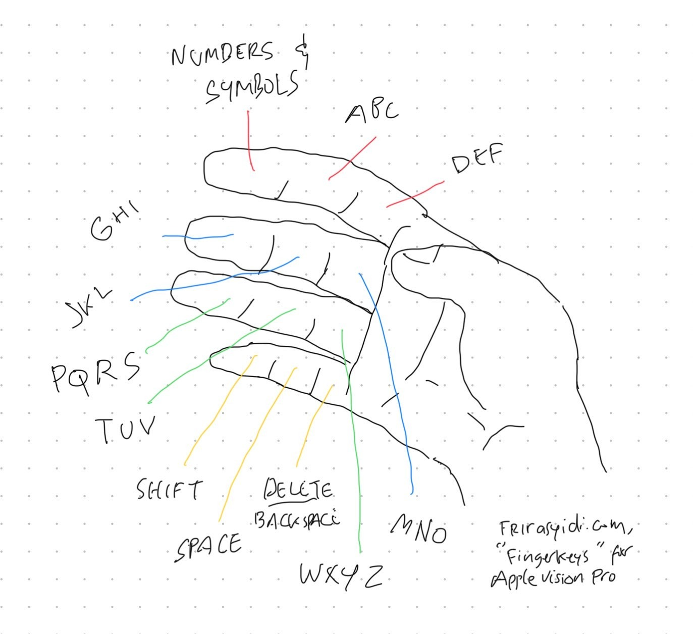
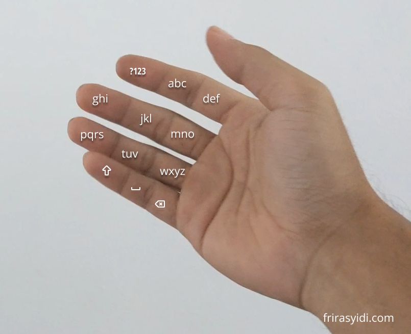
My idea is to simulate the late feature phone’s keyboard as it can be mapped neatly to our finger’s segments. The user then interacts by tapping their thumb to the relevant finger’s segment. Since this interaction is consistent with Apple Vision Pro’s “pinch interaction” pattern, we should be able to use the existing hand-tracking technology.

Aside from the thumb, each segment on each finger is allocated for a specific purpose:
| Left | Middle | Right | |
|---|---|---|---|
| Index | Number & symbols | a, b, c | d, e, f |
| Middle | g, h, i | j, k, l | m, n, o |
| Ring | p, q, r, s | t, u, v | w, x, y, z |
| Little | Shift | Space | Delete/backspace |
Since it has the same mapping as a feature phone’s keyboard, numpads will naturally fit the layout, exactly like the one on your phone:
| Left | Middle | Right | |
|---|---|---|---|
| Index | 1 | 2 | 3 |
| Middle | 4 | 5 | 6 |
| Ring | 7 | 8 | 9 |
| Little | * | 0 | # |
Just like when it was implemented in the feature phone, the problem with this keyboard is that you need to multi-tap a button to get to the corresponding character you need. For example, you need to tap 3 times on the middle segment of your index finger to get “C”.
Fortunately, this experience can be easily improved by using autocorrect and suggestions via AI. The technology should enable the user to tap just once per segment.
The experience should feel pretty nice as it is tactile as you press your thumb against your finger, and, it can also be enriched by adding a tapping sound every time a keypad is pressed.
Here’s a concept demo:
The benefit of this concept is that the user can develop muscle memory to enable faster typing. Just like typing with a full keyboard, the more they use it, the more natural it becomes.
Unlike the look and pinch method, this concept also frees a more prominent user’s sight during typing. This should enable the user to see what’s written in the text field and evaluate the text.
This concept should also look more discreet from an observer’s point of view. No more hilarious looks from tapping empty spaces, no more excessive Italian hand gestures while shaking your head simultaneously, and you don’t have to say things out loud.
To make it easier to use and learn, we can create an interface with each character overlaid on top of the corresponding finger segment like below:

What do you think of this concept?